Spanish may be one language, but the communities that speak it are incredibly diverse. A family with roots in Mexico may use different vocabulary than a family from Puerto Rico. Someone from El Salvador may have different cultural references than someone from the Dominican Republic. While everyone may understand one another, the language they grew up with is shaped by history, culture, and community.
That’s exactly why we created our Regional Spanish Preferences Across the United States map. Rather than making assumptions about where different Hispanic communities live, we wanted to let the data tell the story.
Using 2024 American Community Survey (ACS) 5-Year Estimates from the U.S. Census Bureau, we analyzed each state’s Hispanic/Latino population by country of origin. We used 5-Year Estimates because they provide information about population movement over time. From there, we developed a methodology that classifies a state when one origin group represents at least 10 percentage points more than the next largest group. If no group has that lead, the state is classified as Mixed / Neutral, recognizing that many Hispanic communities are shaped by multiple cultures rather than one dominant background.
Looking Beyond the Colors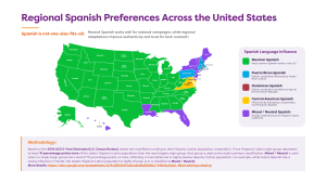
At first glance, the map is a collection of colors, but if one looks a little closer, it becomes a story about migration, history, and the communities that have helped shape different parts of the United States.
The Southwest is a great example.
Arizona, California, Texas, and much of the western United States appear as Mexican Spanish because the data shows that people of Mexican origin make up the largest share of the Hispanic population in those states. Arizona’s Hispanic population is nearly 86% of Mexican origin, while California and Texas are both over 80%. 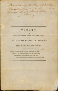
These numbers aren’t surprising when you consider the region’s history. Much of today’s Southwest was once part of Mexico before the Treaty of Guadalupe Hidalgo in 1848. Over generations, communities were able to remain. Families grew, and additional migration continued through established family networks and economic opportunities. Today, Mexican American culture is deeply woven into the identity of these states. The culture influences everything from food and traditions to language and local media.
As you move east, the picture begins to change.
Connecticut and Pennsylvania are classified with Puerto Rican influence, while Rhode Island reflects a strong Dominican influence. These patterns mirror decades of migration to Northeastern cities like New York, Hartford, Providence, and Philadelphia, where Puerto Rican and Dominican communities established vibrant neighborhoods that continue to grow through family reunification and community ties.
The Mid-Atlantic tells another unique story.
Maryland and Virginia stand out because of their significant Central American populations. According to the population table, nearly 47% of Maryland’s Hispanic population identifies as Central American, while Virginia is nearly 36%. This reflects migration patterns that accelerated during the 1980s and 1990s, when many Salvadoran, Guatemalan, and Honduran families settled in the Washington, D.C. metropolitan area. They were mainly placed there because it is where the United States provides refuge, but some Central Americans decided to expand further from the D.C area. Today, those communities continue to shape the region’s everyday life and aspects.
Why Some States Are Mixed
One of the biggest attributes in this project is our methodology. Instead of assigning every state to one language influence, we recognized that some places simply don’t have one dominant Hispanic community.
Florida is a perfect example.
While Cuban culture has had an undeniable influence on the state, the data shows that Florida’s Hispanic population is also made up of large Puerto Rican, South American, Venezuelan, Colombian, Dominican, and Mexican communities. Although Cuban Americans represent the largest individual origin group, they do not lead the next largest community by at least 10 percentage points. Under our methodology, Florida is classified as Mixed / Neutral.
The same is true for states like Delaware, Hawaii, New Jersey, and Vermont, where multiple Hispanic communities contribute to the local culture without one group clearly dominating the population. Although Louisiana is right in the middle of the South, it is also an example of a mixed/neutral state because of its rich agriculture, oil, and construction opportunities.
This isn’t a limitation of the data. It’s actually one of its greatest strengths. It reminds us that Hispanic audiences cannot always be represented by a single country of origin or a single version of Spanish.
Why This Matters for Marketers
So, does this mean brands need five different versions of every campaign? Not necessarily. 
For national campaigns, Neutral Spanish often provides the broadest reach because it avoids highly regional vocabulary while remaining natural and widely understood. However, when developing local campaigns or community outreach, understanding the communities behind the language can help brands create messaging that feels more authentic and personable. The goal isn’t perfect regional vocabulary, but cultural understanding. When marketers recognize who they’re speaking to, they’re better equipped to create campaigns that reflect local communities and build relationships.
Data Helps Us See the Bigger Picture
Our map is more than a visualization of demographics, but a reminder that behind every statistic is a community with its own history, traditions, and voice. The population table provides the numbers, while the map helps bring those numbers to life.
Together, they offer a more thoughtful way to approach multicultural marketing, one that moves beyond translation and toward genuine cultural connection. Because the most effective multicultural marketing doesn’t just speak Spanish, but it understands the people behind the language.